Discover how to enhance your presentation slides by customizing graphs effortlessly with artificial intelligence. This guide explores the innovative tools and methods that enable you to create visually appealing and effective graphs that communicate your data clearly and professionally.
By integrating AI-powered features into your slide creation process, you can automate color schemes, labels, and layout suggestions, ensuring your visuals are both engaging and tailored to your content. Whether you are aiming to improve readability or explore alternative styles, AI provides a seamless way to elevate your presentation design.
Understanding the Basics of Graph Customization in Slides
Effective presentation of data hinges on clear and visually appealing graphs that communicate information efficiently. Customizing graphs within presentation slides allows presenters to tailor visualizations to their specific audiences and objectives, enhancing comprehension and engagement. Grasping fundamental principles of graph customization ensures that data is represented accurately and attractively, laying the foundation for impactful presentations.
While manual customization offers control over every detail, it often involves time-consuming adjustments and limited flexibility. This can hinder the ability to quickly adapt visualizations, especially when dealing with large datasets or multiple graphs. AI-powered tools, therefore, play a vital role in streamlining graph customization, enabling dynamic, precise, and aesthetically consistent modifications that elevate the overall quality of presentations.
Fundamental Principles of Customizing Graphs in Slides
Customizing graphs effectively involves understanding several core principles that ensure clarity, accuracy, and visual appeal. These principles guide the process from initial setup to final adjustments, helping presenters communicate their data effectively.
- Alignment with Data Storytelling: Customizations should serve the narrative, highlighting key trends, comparisons, or patterns relevant to the presentation’s message.
- Consistency in Style: Maintaining consistent fonts, colors, and styles across all graphs and slides helps create a cohesive visual experience.
- Clarity and Simplicity: Avoid clutter by choosing appropriate chart types and limiting unnecessary decorations, which ensures the audience can interpret data swiftly.
- Accurate Data Representation: Customizations must preserve the integrity of data, avoiding distortions that could mislead viewers.
- Effective Use of Color and Labels: Colors should differentiate data series clearly, and labels should be concise yet informative, aiding quick understanding.
Common Types of Graphs and Their Purposes
Understanding the common graph types used in presentations helps in selecting the most suitable visualization for specific data sets and objectives. Each type serves a particular purpose and conveys information differently, impacting how the audience perceives and interprets data.
| Graph Type | Purpose | Typical Data |
|---|---|---|
| Bar Chart | Comparing quantities across categories | Sales by region, survey responses, product performance |
| Line Chart | Showing trends over time or continuous data | Stock prices, temperature changes, website traffic |
| Pie Chart | Illustrating proportions and percentage shares | Market share distribution, budget allocations |
| Scatter Plot | Exploring relationships or correlations between variables | Advertising spend vs. sales, age vs. income |
| Area Chart | Depicting cumulative data and proportions over time | Market growth, resource allocation |
Limitations of Manual Graph Customization Without AI Tools
Manual customization of graphs, while offering control, presents several challenges that can impede efficiency and consistency. Without the assistance of AI tools, presenters often encounter limitations that can compromise the quality and adaptability of their visualizations.
- Time-Intensive Processes: Manually adjusting colors, labels, axes, and styles can be laborious, especially when managing multiple graphs or large datasets.
- Inconsistency in Design: Achieving uniform style and formatting across various graphs requires meticulous effort; inconsistencies can detract from professionalism.
- Limited Flexibility: Manual edits may not easily accommodate real-time data updates or rapid changes, leading to outdated or misaligned visuals.
- Prone to Human Error: Manual interventions increase the risk of errors such as incorrect labels, scale mismatches, or misrepresentations of data.
- Lack of Advanced Aesthetic Options: Designing visually appealing graphs with sophisticated aesthetics often requires additional software or skills beyond basic manual tools.
AI-driven customization tools address these limitations by automating routine adjustments, ensuring consistency, and enabling rapid updates, ultimately enhancing the professionalism and effectiveness of presentation visuals.
Integrating AI Tools for Graph Customization
Enhancing graph customization in presentation slides through AI integration offers a new level of efficiency and visual appeal. Modern slide software increasingly incorporates AI-powered features that facilitate dynamic and intelligent graph modifications, saving time and improving accuracy. Recognizing and utilizing these tools allows users to create more compelling and tailored visual data representations with minimal manual effort.
AI integration in slide applications streamlines various elements of graph customization, from automatic color palette selection to intelligent label placement and data interpretation. By leveraging these features, users can achieve professional-quality visuals that are both aesthetically pleasing and easy to interpret, even without advanced graphic design skills. Connecting AI capabilities with slide software involves understanding specific tools, activating relevant features, and applying AI-driven suggestions to enhance your presentation’s impact.
AI-Powered Features and Tools for Graph Customization
Most contemporary slide applications come equipped with built-in AI features or can be integrated with third-party AI tools to optimize graph customization. These features harness machine learning algorithms and data analysis techniques to assist users in refining their visualizations efficiently. Common AI-powered features include:
| Feature | Description | Benefits |
|---|---|---|
| Color Scheme Automation | AI algorithms analyze the data and suggest harmonious color palettes that enhance readability and visual appeal. | Ensures consistent, professional-looking colors that match the presentation’s theme, reducing manual color selection time. |
| Label Optimization | Intelligent placement and formatting of axis labels, data labels, and annotations to improve clarity and avoid overlaps. | Creates cleaner, more readable graphs without manual fine-tuning. |
| Data Representation Suggestions | AI evaluates data patterns and recommends the most effective chart types or modifications to better illustrate insights. | Helps select the appropriate visual format, enhancing the communicative power of the data. |
| Automated Data Trend Analysis | Detects trends and anomalies in the data, suggesting visual cues like highlights or trend lines. | Facilitates quick identification of key insights within complex datasets. |
Automating Color Schemes, Labels, and Data Representations with AI
AI-driven automation simplifies the customization process by intelligently adapting visual elements based on the data context and presentation goals. For example, when creating a sales performance chart, AI can automatically generate a color scheme that differentiates regions or products effectively. Similarly, labels are dynamically positioned to avoid overlap and improve legibility, while data representations are adjusted to best showcase key insights.
By automating these aspects, AI reduces manual effort, eliminates guesswork, and ensures consistency across multiple graphs within a presentation. This automation relies on algorithms trained on large datasets and design principles, which enable AI to make informed suggestions tailored to the specific data and audience.
Connecting AI Features with Slide Applications: A Step-by-Step Guide
Establishing a seamless connection between AI tools and slide applications is crucial to maximize the benefits of AI-assisted graph customization. Here is a concise step-by-step guide to integrate and utilize AI features:
- Update Your Software: Ensure your slide application (e.g., Microsoft PowerPoint, Google Slides, or other platforms) is updated to the latest version that supports AI integrations or includes built-in AI features.
- Access AI Features: Locate the AI-powered tools within the application’s toolbar or menu. This might be labeled as “Design Ideas,” “Smart Suggestions,” or “AI Assist.”
- Connect to AI Services: For third-party AI tools, follow the integration instructions, which typically involve granting permissions, signing into your accounts, or installing plugins or add-ins.
- Prepare Your Data: Insert or select the data set you wish to visualize. Proper data formatting ensures better AI recommendations.
- Activate AI Assistance: Enable the AI features to analyze your data. The tool will generate suggestions related to color schemes, chart types, labels, and other visual elements.
- Review and Customize: Examine the AI-generated recommendations. Adjust settings or accept suggestions to refine the graph accordingly.
- Apply Changes: Confirm the modifications, and the AI-enhanced graph will be integrated into your slide. Save your work to preserve these customizations.
Utilizing this step-by-step approach ensures efficient integration of AI tools into your presentation workflow, resulting in visually appealing and insightful graphs that effectively communicate your data stories.
Utilizing AI-Driven Design Suggestions for Graphs
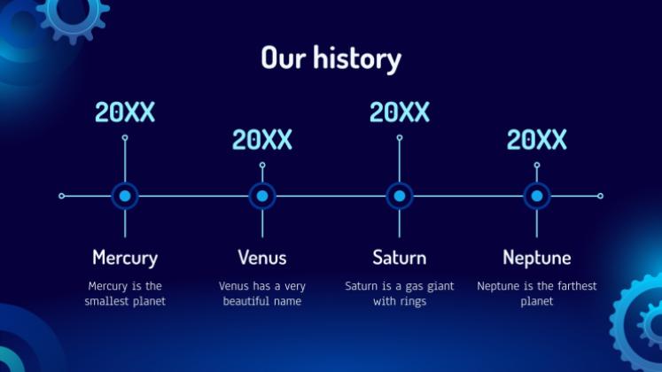
Incorporating AI-driven design suggestions into your graph creation process can significantly enhance visual appeal and data clarity. Modern AI tools analyze your existing graph data and layout, offering actionable recommendations to improve overall presentation quality. By leveraging these intelligent insights, users can craft more compelling and easily interpretable visualizations that resonate with their audience.
AI suggestions often encompass layout adjustments, color schemes, and element positioning to maximize the impact of your data visualization. These recommendations are generated based on extensive pattern recognition and design principles embedded within AI algorithms, ensuring that your graphs are not only accurate but also aesthetically engaging. This approach streamlines the customization process, making it accessible even for users with limited design expertise.
AI-Suggested Layout Improvements for Visual Impact
AI tools utilize advanced pattern recognition to assess the current layout of your graphs and recommend modifications that enhance readability and visual hierarchy. For example, AI can suggest repositioning data labels for better clarity, adjusting axis scales to better fit the data distribution, or optimizing the spacing between elements to reduce clutter. These improvements aim to guide viewers’ attention toward key insights and facilitate easier data interpretation.
Optimal layout enhancements prioritize clarity, balance, and focus, ensuring that every visual element contributes to a cohesive narrative.
Generating Alternative Graph Styles and Formats Using AI
One of the powerful features of AI in graph customization is its ability to provide diverse style options quickly. By inputting your data, you can receive multiple alternative graph formats—such as switching from bar charts to pie charts, scatter plots, or area graphs—each tailored to highlight different aspects of your data. AI can also suggest thematic styles, color palettes, and design motifs aligning with your branding or presentation theme.
- Experimentation with different chart types enhances storytelling by selecting the most effective visualization for your data.
- AI enables rapid prototyping of styles, saving time compared to manual design adjustments.
- Custom formats can be generated based on specific criteria like data distribution, category emphasis, or audience preferences.
Designing AI-Generated Customization Options for Specific Data Sets
To tailor graphs precisely to your data, you can utilize AI to generate customization options based on the dataset’s unique characteristics. By providing detailed data parameters, AI can suggest modifications such as color schemes that differentiate categories clearly, layout configurations that balance multiple data series, or annotations highlighting key data points. This targeted approach ensures that the visualizations are not only attractive but also accurately represent the underlying data story.
Requesting specific customization options from AI involves specifying your data attributes and visualization goals, enabling the AI to generate tailored recommendations that enhance interpretability.
Customizing Graph Elements with AI Assistance
Leveraging AI to customize graph elements enhances the clarity and visual appeal of presentation slides. Automated modifications to axes, legends, and data points streamline the design process, ensuring consistency and precision. By integrating AI-powered suggestions, users can efficiently refine chart aesthetics, resulting in professional and impactful visualizations.
AI assistance in graph customization facilitates a dynamic and interactive approach to editing, allowing users to focus on data analysis while the AI handles intricate design adjustments. This not only saves time but also promotes explorative creativity in data representation.
Automated Modification of Axes, Legends, and Data Points
Modern AI tools embedded within presentation software enable automatic adjustments of key chart components, including axes, legends, and data points. These tools analyze the data set to optimize axis scales, label placements, and legend positioning, ensuring maximum readability and visual balance.
Procedures involve selecting the chart and activating AI-driven options, which then suggest modifications based on data distribution. For example, AI can automatically rescale axes to highlight significant data ranges or reposition legends to avoid overlap, improving overall chart clarity.
Data points can also be automatically refined through AI suggestions, such as smoothing out outliers or emphasizing key data clusters, which enhances interpretability without manual tweaking. This process ensures that visual elements align with the narrative intent of the presentation.
Applying AI Recommendations for Chart Aesthetics
AI tools provide recommendations for improving the aesthetic aspects of graphs, including color schemes, font choices, and layout adjustments. Once suggestions are generated, users can easily apply these modifications to achieve a cohesive and visually appealing chart.
Using AI-driven design suggestions involves reviewing the proposed changes, such as color palettes that match the presentation theme or font sizes that improve readability. These recommendations are often based on principles of visual hierarchy and accessibility, ensuring the chart is both attractive and functional.
Applying these recommendations may involve clicking a single button or selecting predefined styles within the software. This approach ensures that the chart’s design complements the overall presentation while maintaining data integrity.
Before-and-After Customization Examples
| Component | Before Customization | After AI-Driven Customization |
|---|---|---|
| Axes | Axis labels are cluttered, with inconsistent scales and overlapping tick marks. | Axes are rescaled for clarity, with evenly spaced tick marks and streamlined labels, enhancing readability. |
| Legend | Legend overlaps with data points, making it difficult to interpret the chart. | Legend is repositioned to a clear area, with adjusted size and color matching the chart theme. |
| Data Points | Data points are unevenly distributed, with some outliers distracting from key trends. | Outliers are smoothed, and data points are optimized to highlight major patterns, improving visual coherence. |
Automating Color and Style Adjustments
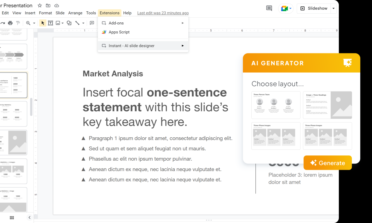
In the realm of data visualization within presentation slides, achieving visually appealing and consistent graphs is crucial. AI-driven tools have revolutionized this process by automating color and style adjustments, enabling users to create more engaging and professional visuals with minimal effort. These intelligent systems analyze data patterns and presentation themes to suggest optimal aesthetic configurations, saving time and enhancing the overall impact of your graphs.
Utilizing AI for color and style customization ensures that your graphs not only accurately represent data but also align seamlessly with your presentation’s branding and design standards. This automation supports consistency across multiple slides and graphs, fostering a cohesive visual narrative that resonates with your audience.
AI Analysis of Data for Optimal Color Schemes and Styles
AI algorithms assess the underlying data within each graph, identifying key trends, variations, and data distributions. For instance, a bar chart depicting sales data may prompt the AI to recommend warm tones like reds or oranges to emphasize high-performing regions, while cooler shades like blues can be used for comparatively lower sales areas. Similarly, pie charts showing market share may benefit from distinct, contrasting colors to easily differentiate segments.
Beyond data patterns, AI considers the overall presentation theme, including branding colors, background styles, and audience preferences. By integrating these factors, AI suggests color schemes that enhance readability, draw attention to critical insights, and maintain visual harmony across slides.
Implementing AI-Driven Color Customization for Different Graph Types
Embedding AI-powered color adjustments involves a systematic approach to ensure consistency and effectiveness across various graph formats:
- Identify the graph type and relevant data attributes, such as categories, values, or segments.
- Activate the AI color suggestion feature within your presentation tool or plugin.
- Allow the AI to analyze the data and the current presentation theme to generate recommended color palettes.
- Review the suggested color schemes, which typically include options optimized for clarity and visual appeal.
- Apply the selected color scheme directly to the graph, with options to customize specific elements if needed.
- Adjust styles such as line thickness, marker shapes, and fill patterns based on AI recommendations for enhanced visual consistency.
For example, in a line graph tracking monthly revenue, AI may suggest a gradient color scheme that smoothly transitions to highlight trends over time, while in a stacked bar chart, contrasting colors can delineate different segments clearly.
Style Options Generated by AI for Various Presentation Themes
AI-driven tools generate a diverse array of style templates tailored to different presentation contexts. These options consider the overall theme, audience, and purpose of the presentation, enabling users to select styles that complement their content. Examples include:
| Theme Type | AI-Generated Style Options |
|---|---|
| Professional Business |
|
| Creative and Artistic |
|
| Educational or Informational |
|
Adopting AI-recommended styles ensures that your graphs are not only accurate but also aesthetically aligned with your presentation’s tone, enhancing overall audience engagement and comprehension.
Enhancing Graph Readability and Engagement
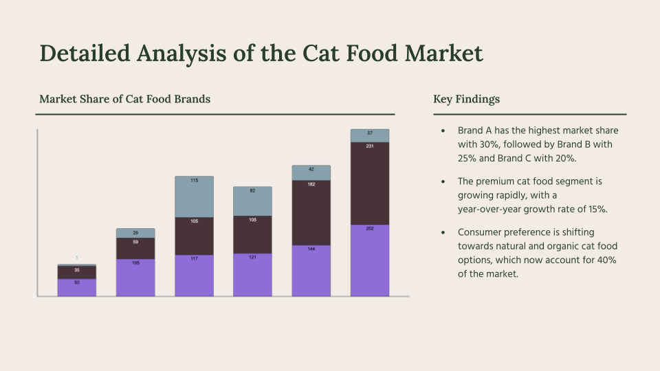
Ensuring that your graphs are not only visually appealing but also easily understandable is crucial for effective communication. AI-powered tools offer valuable support in optimizing various elements of your charts to improve clarity and make your presentations more compelling. By leveraging AI suggestions, users can refine font choices, spacing, labels, and overall design to create engaging and accessible visuals that resonate with diverse audiences.Clear and engaging graphs facilitate better comprehension, especially when presenting complex data.
AI can analyze your current graph setup and recommend adjustments that enhance both visual hierarchy and interpretability. These enhancements help viewers grasp key insights rapidly, fostering more impactful storytelling with data. Incorporating AI-driven feedback ensures your graphs are not only aesthetically pleasing but also functionally effective, striking a balance between style and clarity.
Strategies for Improving Clarity through AI
AI tools can assist in selecting optimal font styles and sizes that improve readability, particularly when dealing with dense or detailed data visualizations. They analyze the proportions and complexity of your graph to suggest font adjustments that prevent clutter and ensure labels stand out without overwhelming the visual. Furthermore, AI can recommend appropriate spacing between elements such as bars, lines, and labels, reducing visual congestion and guiding the viewer’s focus naturally across the graph.AI algorithms also evaluate label placement to avoid overlaps and ensure all annotations are legible.
For instance, in a sales growth chart, AI can suggest repositioning axis labels or data point annotations to enhance clarity. It can identify font styles that are accessible for audiences with visual impairments, such as high contrast and legible typefaces, thus broadening your graph’s reach and effectiveness.
Methods to Incorporate AI Feedback for Engagement
To increase engagement, AI can propose design modifications that make graphs more visually attractive and compelling. This includes recommending color schemes that evoke emotional responses or highlight key data points. AI can analyze the overall color harmony, contrast, and visual balance, suggesting adjustments that draw attention to important trends or outliers without causing distraction.Additionally, AI-driven suggestions may involve adding visual cues like icons, annotations, or animated transitions that emphasize critical insights.
These enhancements can guide viewers naturally through the data story, making the graph not only informative but also memorable. Incorporating AI feedback iteratively allows for real-time refinement, ensuring the final graph aligns with your presentation’s objectives and audience preferences.
Checklist of AI-Suggested Enhancements
Incorporating AI recommendations can significantly elevate your graph’s effectiveness. The following checklist summarizes common AI-suggested improvements for readability and engagement:
- Optimized font styles and sizes for clarity and accessibility
- Adjusted spacing between data points, labels, and elements to reduce clutter
- Strategic label placement to prevent overlaps and enhance legibility
- Color palette recommendations for better contrast and emotional impact
- Highlighting key data points with contrasting colors or visual cues
- Adding annotations or callouts for critical insights
- Inclusion of icons or symbols to symbolize specific data categories
- Incorporation of subtle animations or transitions for dynamic storytelling
- Ensuring visual hierarchy guides viewers intuitively through the data
- Enhancing accessibility features, such as high contrast and legible fonts
Employing these AI-driven suggestions ensures your graphs are not only more engaging but also easier to interpret, fostering clearer communication and more impactful presentations.
Incorporating Descriptive Data Labels and Annotations
Effective data visualization relies not only on the visual elements of graphs but also significantly on the clarity and interpretability provided by labels and annotations. AI-powered tools now facilitate the automatic generation of meaningful labels and annotations that enhance the viewer’s understanding by highlighting key insights and contextual information directly on the graphs. By leveraging AI, users can ensure that their visualizations communicate precise messages, avoid ambiguity, and support informed decision-making with minimal manual effort.Understanding how AI can assist in creating comprehensive labels and annotations involves recognizing its capability to analyze data patterns, identify significant data points, and suggest relevant descriptive text.
AI algorithms can interpret complex datasets to generate labels that accurately describe data categories, trends, or anomalies, thus making the graph more accessible to diverse audiences. Additionally, AI can add contextual explanations to annotations, providing background information or highlighting implications, which enriches the viewer’s comprehension without cluttering the visual layout.
“Effective annotations serve as narrative tools within data visualizations, guiding viewers through complex information by offering clarity, context, and emphasis on critical data points. AI-driven annotation techniques automate this process, ensuring consistent, accurate, and insightful commentary directly embedded into graphs.”
Generating Meaningful Labels and Annotations
AI tools analyze dataset attributes, patterns, and outliers to produce precise labels that reflect the underlying data accurately. These labels can include descriptive names for data categories, units of measurement, or summaries of data segments. For example, in a sales performance graph, AI might automatically generate labels such as “Q1 Sales Peak” or “Year-over-Year Growth,” based on identifying significant fluctuations or trends within the data.Integrating AI-generated annotations involves specifying the data points or regions requiring explanation or emphasis.
The AI then adds brief but informative notes directly onto the graph, which can include explanations of anomalies, contextual details, or comparative insights. This process usually involves setting parameters for AI to recognize important features, such as maximum or minimum values, sudden changes, or clusters, and attach relevant annotations.
Designing Effective Annotation Techniques
Effective annotation techniques involve strategic placement and clear, concise descriptions that add value without overwhelming the visual. Using AI, designers can implement the following methods to optimize annotations:
- Highlighting Key Data Points: AI can identify and mark significant points such as peaks, troughs, or outliers with labels indicating their importance or impact.
- Contextual Explanations: AI-generated notes can provide background or interpretive details, such as market conditions affecting a sales dip or an uptick explained by a recent campaign.
- Trend Annotations: For evolving data, AI can add annotations to illustrate trends, such as “Steady increase from Q2 to Q4” or “Sharp decline following product recall.”
- Comparative Insights: Labels can include comparisons, like “Sales doubled compared to previous quarter,” helping viewers grasp relative changes quickly.
By integrating these annotation techniques, data visualizations become more than mere representations—they transform into narratives that guide the audience through the story behind the data, fostering better understanding and engagement.
Customizing Graphs for Different Content Types
Effective data visualization requires adapting graphs to suit the specific context and audience, whether for business, educational, or technical purposes. Tailoring these visual tools ensures clarity, relevance, and engagement, maximizing the impact of your communication.
AI-powered tools facilitate this customization by offering targeted suggestions, automatic adjustments, and content-aware modifications. Understanding how to leverage AI to modify graphs based on the intended content type enhances presentation quality and audience comprehension across various domains.
Adapting Graphs for Business Content
Business presentations often demand clarity, professionalism, and data-driven insights. When customizing graphs for such contexts, AI tools can assist in highlighting key metrics, emphasizing trends, and aligning the style with corporate branding. For example, a sales performance graph may be styled with the company’s color palette, while AI can suggest the most impactful chart types—such as bar graphs for comparing regions or line charts for tracking growth over time.
AI can also automatically incorporate relevant business KPIs, providing annotations and data labels that spotlight critical insights. For instance, in a quarterly report, AI might suggest emphasizing percentage increases or decreases with color cues, ensuring the key message is immediately apparent to stakeholders.
Optimizing Graphs for Educational Content
Educational visuals aim to enhance understanding and retention. Customizing graphs for this purpose often involves simplifying complex data, adding annotations, and choosing formats that align with pedagogical goals. AI tools excel at generating learner-friendly visuals by recommending clear, uncluttered layouts and meaningful labels that clarify concepts.
For example, an AI might transform a dense statistical table into an easy-to-read pie chart, supplemented with descriptive data labels and annotations that highlight important segments. Such tailored visuals support teaching by visually illustrating relationships, trends, or classifications relevant to students’ learning objectives.
Personalizing Graphs for Technical Content
Technical content typically involves detailed, precise data that appeals to specialists. Customization should focus on accuracy, granularity, and the inclusion of technical annotations. AI assists by ensuring that complex datasets are presented with appropriate scales, axis labels, and detailed legends, facilitating expert analysis.
For instance, in a technical report on sensor data, AI can suggest specific visualization techniques like scatter plots with trend lines, along with annotations highlighting anomalies or key technical thresholds. Additionally, AI can automate the use of specific color schemes to distinguish data series or variable states, ensuring technical precision without sacrificing clarity.
| Content Type | Graph Style & Design Focus | AI Customization Approach |
|---|---|---|
| Business | Emphasize key metrics, use brand colors, highlight trends | Automatic style matching, KPI annotations, trend emphasis |
| Educational | Simplify data, add labels, focus on clarity | Content-aware simplification, educational annotations, learner-friendly formats |
| Technical | Maintain accuracy, detailed legends, technical annotations | Precision alignment, technical labels, anomaly highlighting |
Exporting and Sharing Customized Graphs
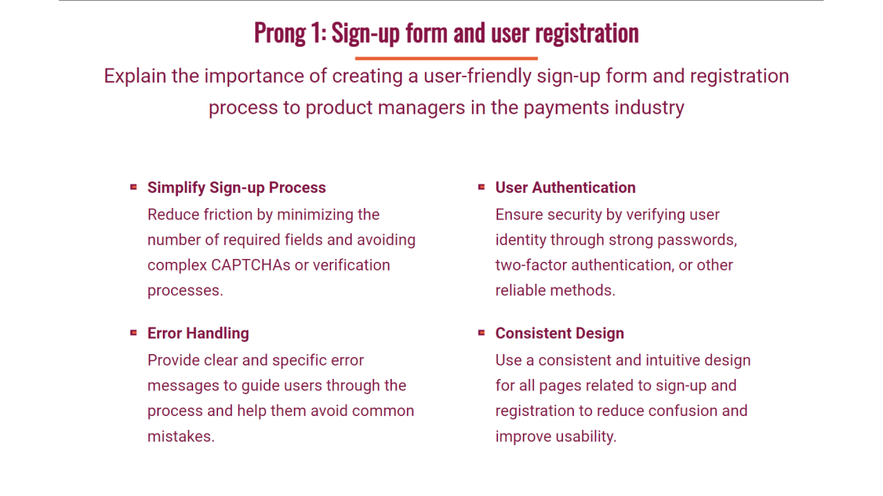
Effective export and sharing of AI-customized graphs are crucial steps in presenting data insights professionally and efficiently. Once a graph has been tailored to meet specific presentation or publication requirements, understanding the best practices for exporting and sharing ensures that the visual integrity is maintained across different platforms and formats. Proper methods facilitate seamless integration into reports, slides, or online content, thereby maximizing the impact of the visual data representation.Exporting and sharing customized graphs involves selecting appropriate formats that balance quality, compatibility, and file size.
It also requires embedding graphs into slides or documents without compromising style or interactivity, especially when utilizing AI-driven design enhancements. Additionally, sharing methods should cater to both static and interactive formats, depending on the audience’s needs and the intended use of the graphs.
Best Practices for Exporting AI-Customized Graphs in Multiple Formats
When exporting graphs customized with AI tools, it is essential to choose formats that best suit the target medium and preserve visual fidelity. Different formats serve various purposes, from print publishing to digital presentations.
- Vector Formats (SVG, PDF, EPS): Ideal for high-resolution output, especially when scaling is necessary without loss of quality. These are suitable for professional printing or detailed presentations.
- Raster Formats (PNG, JPEG, TIFF): Commonly used for web sharing or embedding in documents that do not require scalability. Ensure the resolution (DPI) is sufficient for clarity, generally 300 DPI for print or 72 DPI for web use.
- Interactive Formats (HTML, embed codes): When sharing interactive graphs that users can explore or manipulate online, exporting as HTML or embedding through iframes ensures functionality is retained.
Choosing the appropriate format depends on the dissemination method and the necessity for scalability or interactivity. It is advisable to save the original AI or design file before exporting, allowing for future modifications or format conversions without losing quality.
Embedding Customized Graphs into Slides with Preserved Styles
Embedding AI-customized graphs into presentation slides while maintaining style consistency requires careful handling of file formats and embedding techniques. This ensures the visual aesthetics and interactive features (if any) are preserved, providing a polished and professional appearance.
- Export the graph in a high-quality format compatible with your presentation software, such as PNG or SVG for PowerPoint or Google Slides.
- Insert the exported image directly into the slide, ensuring it maintains its original resolution and style. For SVGs, use the native import functions to allow for further on-slide editing if supported.
- Adjust the size and position within the slide to match the overall design layout, avoiding distortion or pixelation.
- Utilize slide design tools to match the background and surrounding elements, ensuring visual harmony.
For interactive or dynamically generated graphs, consider linking or embedding live data sources, if supported by the presentation platform, to enable real-time updates and interactivity without compromising design consistency.
Procedural Steps to Share Interactive or Static Graphs Generated by AI
Sharing AI-generated graphs effectively involves selecting suitable channels and formats, followed by clear procedural steps to ensure the recipient accesses the intended visual with all its features intact.
- Determine whether the graph is static or interactive based on the sharing context and audience engagement needs.
- For static graphs, export in a high-resolution image or PDF, then embed into reports, presentations, or email attachments.
- For interactive graphs, generate the output in HTML, embed code, or web-compatible formats that support user interaction.
- Use cloud-based sharing platforms such as Google Drive, Dropbox, or specialized data visualization portals to host interactive graphs, providing access links to recipients.
- Ensure that shared files are accessible across devices and platforms by testing them beforehand. For online sharing, verify that interactive features such as tooltips, zooms, or filters work correctly within the web environment.
- Provide clear instructions or contextual explanations when sharing, especially for interactive graphs, to guide users on how to navigate and interpret the visual data effectively.
Incorporating AI-driven graphs into collaborative workflows or online presentations enhances data-driven communication, enabling stakeholders to interact with and understand the insights more deeply. Following these best practices guarantees that the visual integrity and functionality of customized graphs are preserved throughout the sharing process.
Conclusion
In conclusion, utilizing AI for graph customization in slides offers a powerful approach to producing compelling and accurate visual data representations. Embracing these tools can save time and enhance the clarity and impact of your presentations, making your data storytelling more effective and memorable.