Understanding how to generate infographic charts using AI opens new horizons for creating compelling visual representations of data with efficiency and precision. Leveraging artificial intelligence not only streamlines the design process but also enhances the clarity and impact of your visuals, making complex information more accessible and engaging for your audience.
This guide explores the essential components, step-by-step procedures, popular tools, and best practices for harnessing AI in infographic creation, empowering you to craft visually appealing and informative graphics with ease and professionalism.
Introduction to Infographic Charts and AI
Infographic charts serve as powerful tools in visual communication, transforming complex data sets into easily understandable visual narratives. They combine graphical elements, such as icons, colors, and charts, to convey insights efficiently and engagingly, making information more accessible for diverse audiences ranging from corporate stakeholders to casual learners. In an era where data-driven decision-making is paramount, the ability to craft compelling visual representations is highly valued.
Artificial intelligence (AI) has emerged as a transformative force in the realm of data visualization. By leveraging advanced algorithms and machine learning techniques, AI enhances the process of creating infographic charts, enabling automation, customization, and improved accuracy. AI-driven tools can analyze raw data, identify key patterns, and generate visually appealing charts with minimal human intervention, thus saving time and reducing errors.
This integration of AI with infographic creation not only streamlines workflows but also empowers users to produce professional-quality visuals regardless of their technical expertise.
AI Tools for Generating Visual Data Representations
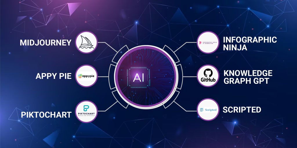
The landscape of AI tools designed for infographic and chart generation offers a diverse array of solutions tailored to different needs and skill levels. These tools aim to simplify the visualization process, making it accessible to both novices and experienced data analysts. Understanding the available options and their functionalities helps users select the most appropriate tool for their specific projects.
Many AI-powered platforms provide intuitive interfaces that facilitate quick chart creation through features such as automatic data analysis, template recommendations, and customizable design elements. Examples include:
- Canva’s AI-powered design assistance: Offers intelligent suggestions for layouts and visual elements based on the data uploaded.
- Visme: Incorporates AI to recommend suitable chart types and visual styles to best represent the data insights.
- Datawrapper: Uses AI algorithms to help analyze data patterns and suggest optimal visual formats, particularly for complex datasets.
- Tableau’s Einstein Analytics: Integrates AI to automate data preparation, identify trends, and generate insightful visualizations with minimal manual effort.
| Features of AI-based Chart Tools | Benefits |
|---|---|
| Data analysis and pattern recognition | Identifies key insights for visualization, reducing manual data exploration |
| Template and style recommendations | Ensures consistent and professional aesthetics suitable for various contexts |
| Automated layout adjustments | Optimizes visual clarity and balance without extensive user input |
| Integration with data sources | Allows seamless data import from spreadsheets, databases, or cloud services |
“AI-driven infographic creation democratizes data visualization, making complex insights accessible and engaging for all users.”
Essential Components of AI-Generated Infographics
Creating compelling infographics with AI involves integrating multiple key components that work seamlessly to communicate data-driven stories visually. These elements include accurate data sourcing, appealing design aesthetics, and interactive functionalities that enhance user engagement. Understanding how AI automates and harmonizes these components is crucial for producing cohesive and impactful visual narratives.
AI-powered tools streamline the development process by intelligently sourcing, organizing, and visualizing data, while also applying aesthetic principles and interactive features. This automation reduces manual effort, minimizes errors, and ensures consistency across the infographic, ultimately delivering a polished and engaging presentation of information.
Data Sources
Data sources underpin the credibility and accuracy of any infographic. Reliable sources such as government databases, reputable research institutions, and verified industry reports provide the foundational data for visual storytelling. AI tools automatically collect, validate, and categorize this data, ensuring that the information presented is current and trustworthy. For example, AI can aggregate COVID-19 statistics from official health departments to create real-time pandemic trend visualizations.
Design Aesthetics
Design aesthetics encompass color schemes, typography, layout, and visual hierarchy, which are vital for readability and aesthetic appeal. AI-driven design platforms analyze the content and apply principles of visual communication to optimize the infographic’s look. They can suggest color palettes that evoke the right emotional response, select fonts that enhance clarity, and organize elements to guide viewers through the story intuitively.
For instance, AI can automatically adjust the spacing and alignment of chart elements to improve overall balance and harmony.
Interactivity
Interactivity transforms static data into engaging experiences, allowing users to explore information dynamically. Features such as hover effects, clickable elements, filters, and drill-down options foster deeper understanding. AI enhances interactivity by intelligently integrating these features based on user behavior and data complexity. For example, an AI-generated financial infographic may enable viewers to click on specific data points for detailed insights or toggle between different time periods for trend analysis.
This interactivity not only improves user engagement but also enables personalized storytelling.
Structuring Components with AI Automation
Artificial intelligence automates the integration of data sources, aesthetics, and interactivity by employing algorithms that analyze the content, context, and target audience. This process ensures that each component complements the others, resulting in a cohesive visual narrative. AI tools can automatically align color schemes with data categories, synchronize interactive elements with visual flow, and update data dynamically when new information becomes available.
This orchestration allows creators to focus on high-level storytelling while AI handles the technical nuances, producing visually appealing and informative infographics that effectively communicate complex data stories.
Step-by-Step Procedures for Creating Infographics Using AI
Transforming raw data into compelling visual narratives through AI-driven tools involves a structured series of steps. Each phase ensures that the resulting infographic is both informative and visually engaging, leveraging AI’s capabilities to streamline and optimize the process.
Implementing this workflow involves careful data handling, intelligent selection of visualization types, and precise customization of design elements. Following these steps guarantees a coherent and impactful infographic that effectively communicates the intended message to the audience.
Data Input and Initial Processing
Effective infographic creation begins with gathering and preparing data for analysis. Accurate and relevant data serve as the foundation for meaningful visualizations. AI tools facilitate this by enabling automated data collection from various sources, such as databases, spreadsheets, or web scraping. Once the data is collected, preprocessing steps are necessary to ensure quality and consistency.
- Data Collection: Use AI-powered data extraction tools to compile datasets from multiple sources, ensuring completeness and relevance.
- Data Cleaning: Employ AI algorithms to identify and correct inconsistencies, missing values, or errors within the dataset. Techniques such as anomaly detection and imputation are commonly used.
- Data Transformation: Normalize or scale data as needed, converting categorical data into numerical formats where applicable. AI-based feature engineering can automate this process, highlighting the most significant variables for visualization.
Analyzing Data Patterns and Selecting Chart Types
Understanding the underlying patterns and relationships within data guides the choice of appropriate visual formats. AI algorithms can analyze data distributions, correlations, and trends efficiently, providing insights that inform visualization decisions.
- Pattern Recognition: Utilize AI models such as clustering or classification to identify data groupings, outliers, or trends.
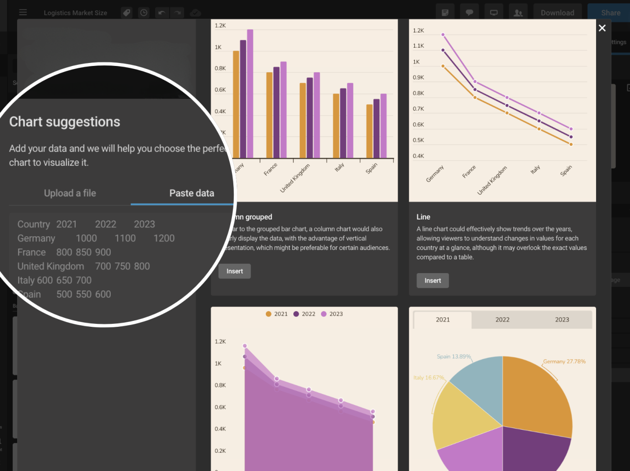
- Chart Type Determination: Based on the identified patterns, AI suggests optimal chart types. For example, time series data with clear trends may be best represented through line charts, while categorical comparisons may suit bar or pie charts. AI tools often offer recommendation modules that analyze the data structure and propose suitable visual formats.
- Validation of Choices: Cross-verify AI suggestions with domain knowledge or user input to confirm the most effective visualization approach.
Customizing Design Elements with AI-Driven Suggestions
Refining the visual appeal and clarity of infographics involves customizing design components. AI-powered design assistants can offer intelligent suggestions to enhance readability, aesthetics, and overall impact.
- Color Palette Selection: AI analyzes the data context and suggests appropriate color schemes that improve contrast and accessibility, especially for color-blind friendly palettes.
- Typography and Layout: Automated recommendations help choose fonts and layout styles that emphasize key data points while maintaining visual harmony.
- Iconography and Annotations: AI can suggest relevant icons, labels, or annotations to highlight critical insights, making the infographic more intuitive.
- Design Consistency: Use AI-based tools to ensure uniformity across various elements, maintaining a professional and cohesive appearance throughout the infographic.
Popular AI Tools and Platforms for Infographic Generation
Advancements in artificial intelligence have significantly expanded the repertoire of tools available for creating compelling infographics. These platforms leverage AI algorithms to simplify design processes, enhance visual appeal, and optimize data presentation, making infographic creation accessible to users with varying levels of technical expertise. Choosing the right tool depends on several factors, including ease of use, customization capabilities, and the quality of the final output.
Understanding the features and benefits of leading AI-powered infographic tools helps users select the most suitable platform to meet their specific needs and project goals.
Below is a detailed overview of some of the most popular AI tools and platforms designed to facilitate infographic creation. Each tool offers unique features, pricing models, and use cases, enabling users to streamline their workflow effectively and produce professional-quality visuals.
AI-Powered Tools and Platforms for Infographic Creation
| Tool Name | Features | Cost | Suitable Use Cases |
|---|---|---|---|
| Canva with AI Integrations | Intuitive drag-and-drop interface, AI-assisted design suggestions, vast library of templates, customizable graphics, and fonts. | Free tier available; Pro plans start at $12.99/month | Marketing materials, educational infographics, social media visuals, business reports |
| Piktochart | AI-driven data visualization, automatic layout adjustments, vast template collection, drag-and-drop editor, collaboration features. | Free basic plan; Premium plans start at $24.17/month | Business reports, data presentations, educational content |
| Visme | AI-powered content suggestions, interactive infographic options, extensive template library, rich media integration. | Individual plans from $15/month; Teams from $29/month | Corporate reports, interactive presentations, training materials |
| Venngage | AI-assisted design recommendations, easy-to-use editor, customizable templates, data import features. | Basic free plan; Premium at $19/month | Marketing campaigns, data storytelling, event promotion |
| Designs.ai | AI-powered branding suite including infographic creation, logo design, video editing, and mockups; automated design generation. | Plans start at $29/month | Branding projects, quick infographic development, social media content |
Each of these platforms streamlines the infographic creation process by automating design elements, optimizing data presentation, and providing ready-to-use templates, thus reducing the time and effort required to produce professional visuals. For example, Canva’s AI-driven suggestions help users customize templates efficiently, while Piktochart’s data visualization tools enable the transformation of complex datasets into engaging visual stories. Visme’s interactive features are particularly useful for creating engaging online reports, and Venngage’s data import capabilities facilitate quick data integration.
Designs.ai combines multiple functionalities, offering an all-in-one solution for branding and infographic needs, making it especially suitable for businesses seeking a comprehensive AI-powered design platform.
Designing Effective Infographics with AI Assistance
Creating impactful infographics requires a careful balance of visual clarity, aesthetic appeal, and accurate data representation. Leveraging AI tools can significantly enhance this process by providing intelligent recommendations and automating design adjustments that align with best practices in visual communication. AI-powered design assistance ensures that infographics are not only visually appealing but also effectively convey complex information in an engaging manner.
By integrating AI into the design workflow, creators can benefit from real-time suggestions on color schemes, font choices, and layout arrangements. This symbiosis of human creativity and machine intelligence results in infographics that are both eye-catching and easy to understand, fostering better audience engagement and knowledge retention.
Principles of Effective Visual Communication Enhanced by AI
Effective visual communication revolves around clarity, consistency, and purpose. AI enhances these principles by analyzing data patterns and suggesting design elements that improve readability and focus. For example, AI algorithms can identify which visual formats best highlight key data points or trends, ensuring that viewers grasp the intended message swiftly.
Additionally, AI can assist in maintaining consistency across multiple infographics within a campaign or publication. By learning from style guides and previous designs, AI tools can recommend uniform color palettes, font styles, and spacing, creating a cohesive visual identity that reinforces branding and message clarity.
Methods for Selecting Color Schemes, Fonts, and Layouts Using AI Recommendations
Choosing the right visual elements is crucial for creating engaging infographics. AI-driven platforms often incorporate algorithms that analyze the content and context to recommend appropriate color schemes, font types, and layout structures. These recommendations are based on principles of color psychology, readability, and data hierarchy.
Color schemes are suggested based on contrast, harmony, and the emotional impact desired. For instance, AI may recommend a palette with contrasting hues for data points to ensure clear differentiation, or calming tones for health-related topics to evoke trust and reassurance. Font selection tools powered by AI analyze legibility, font pairing compatibilities, and the tone of the content to suggest optimal typefaces.
Layouts are optimized through AI by evaluating the amount of information, visual flow, and viewer engagement. These tools can automatically generate multiple layout options, allowing designers to select the most effective arrangement that balances informational density with visual simplicity.
Balancing Information Density and Visual Appeal
An essential aspect of effective infographic design is managing the trade-off between comprehensive data presentation and visual simplicity. Overloading a graphic with information can overwhelm viewers and diminish comprehension, while undersimplification may omit critical insights. AI tools facilitate this balance by analyzing the content complexity and suggesting design adjustments that highlight key messages without clutter.
For example, AI can identify which data points are most relevant and suggest their placement to maximize clarity. It can also recommend the use of visual hierarchies—such as larger fonts or contrasting colors—to draw attention to primary information, while secondary details are presented more subtly. This ensures that viewers focus on the core message while accessing supplementary data as needed.
Best Practices for Designing Engaging Infographics
To craft visually compelling and informative infographics with AI assistance, consider these best practices:
- Prioritize clarity by defining a clear visual hierarchy that guides viewers through the information logically.
- Utilize AI recommendations to select harmonious color schemes that enhance readability and evoke appropriate emotional responses.
- Choose clean, legible fonts suited to the tone and audience, with AI aiding in font pairing and size optimization.
- Maintain a balanced layout that avoids overcrowding, ensuring each element has sufficient space to breathe.
- Use contrasting colors and varied font weights to emphasize critical data points and sections.
- Incorporate visual elements like icons, charts, and images recommended by AI to complement textual information and improve engagement.
- Test multiple design variations generated by AI tools to compare effectiveness and select the most impactful version.
- Ensure consistency across all infographic components to reinforce brand identity and message coherence.
Automating Data Visualization Tasks with AI
Efficient data visualization is crucial for transforming raw data into insightful, visually appealing infographics. Leveraging AI to automate these tasks not only accelerates the process but also enhances accuracy and consistency, especially when handling large or dynamic datasets. This section explores how to effectively organize datasets for AI-driven visualization, streamline real-time data integration, and dynamically customize infographic templates through automation techniques.Organizing datasets effectively is foundational for successful AI-powered visualizations.
Proper data structuring involves categorizing data points, ensuring data cleanliness, and formatting datasets in compatible formats such as CSV, JSON, or XML. Clear labeling and consistent units facilitate seamless ingestion by AI algorithms. When datasets are well-organized, AI tools can efficiently analyze patterns, identify relevant trends, and generate accurate visual representations without manual intervention.To automate updates and incorporate real-time data into infographics, establishing a reliable data pipeline is essential.
This typically involves integrating APIs or data connectors that continuously fetch new information from sources like databases, cloud services, or IoT devices. Using scripting languages such as Python or platforms that support automation workflows, like Zapier or Integromat, allows automatic data refreshes at scheduled intervals. These updates can then trigger AI algorithms to regenerate or modify visualizations dynamically, ensuring that the infographics always reflect the latest data.Techniques for dynamically customizing templates through AI focus on enabling adaptive designs that respond to changing data or user preferences.
AI-driven systems can modify colors, layouts, and data highlights based on predefined rules or predictive insights. For example, an AI model analyzing sales data might automatically emphasize regions experiencing growth or decline by adjusting color schemes or chart styles. Employing template parameters linked to AI outputs allows for real-time customization, making infographics more engaging and contextually relevant.
| Automation Workflow Element | Description |
|---|---|
| Data Collection | Use APIs or data connectors to fetch real-time datasets from sources like CRMs, databases, or IoT devices. |
| Data Processing | Apply data cleaning and structuring scripts to prepare datasets suitable for AI analysis and visualization. |
| AI Analysis | Implement AI models to identify insights, trends, or anomalies within the datasets, informing visualization focus points. |
| Template Customization | Automate template modifications such as color schemes, layouts, or element emphasis based on AI insights or user preferences. |
| Visualization Update | Trigger generation of updated infographics automatically whenever new data is available, ensuring real-time accuracy. |
“Automation in data visualization streamlines the entire process from data collection to presentation, enabling organizations to respond swiftly to changing information and deliver timely insights.”
Advanced Techniques for Customizing AI-Generated Infographics
As organizations and creators seek to produce visually captivating and brand-consistent infographics, mastering advanced customization techniques becomes essential. These methods allow for tailoring AI-generated visuals to align with specific branding guidelines, incorporate interactive features, and produce high-quality outputs suitable for diverse platforms. Leveraging these techniques enhances the overall impact and professionalism of the infographics, making them more engaging and accessible to audiences.
In this section, we explore sophisticated methods for refining AI suggestions, integrating interactive and animated elements, exporting in various high-quality formats, and designing complex, layered infographics that effectively communicate multifaceted data stories.
Refining AI Suggestions to Match Branding and Style Guides
Customizing AI-generated infographics to adhere to branding standards is crucial for maintaining consistency and brand recognition. This involves several strategic approaches:
- Creating Style Templates: Develop predefined style templates that include specific color palettes, font families, icon sets, and layout preferences. Many AI tools allow users to save these templates and apply them automatically during generation.
- Using Style Transfer Techniques: Employ AI models trained to apply brand-specific styles to visual content. These models can modify color schemes, iconography, and typography to match branding guidelines precisely.
- Iterative Feedback and Fine-Tuning: Generate initial infographics and provide detailed feedback to the AI tool, adjusting parameters such as color harmony, font sizes, and element spacing until the visual aligns with the brand’s identity.
- Incorporating Brand Assets: Integrate logos, specific imagery, and custom icons directly into the AI prompts or as overlays post-generation, ensuring a consistent visual narrative.
By systematically applying these methods, users can produce infographics that not only convey the intended data but also reinforce brand recognition and aesthetic coherence.
Incorporating Interactive Elements and Animations Using AI Tools
Creating dynamic, engaging infographics involves embedding interactive features and animations. Modern AI-powered design platforms facilitate these enhancements seamlessly:
- Adding Clickable Data Points: AI tools can generate infographics with embedded links or hover-over effects for specific data points, allowing users to access additional information or navigate to related content.
- Integrating Animations: Use AI-assisted features to animate chart elements, such as bars growing, lines drawing themselves, or icons moving, which helps in emphasizing key insights. Platforms like Canva or Adobe Express offer AI-driven animation options that can be customized easily.
- Embedding Interactive Layers: Combine multiple layers of data that users can toggle on or off, providing a layered storytelling experience. AI platforms can assist in organizing these layers for clarity and ease of interaction.
- Automated Script Generation for Interactivity: Some AI tools can generate scripts or code snippets for embedding infographics within websites, enabling interactive features such as filters, search functions, or real-time data updates.
Incorporating these features transforms static visuals into engaging experiences that facilitate deeper understanding and user interaction.
Procedures for Exporting High-Quality Visuals in Various Formats
Ensuring that infographics are exported in high-resolution formats is vital for professional presentation, printing, and online sharing. The process includes:
- Choosing Appropriate Output Formats: Select formats such as PNG, JPEG, SVG, or PDF depending on the intended use. For web use, SVG and PNG are preferred for clarity and scalability; for print, PDF and high-resolution JPEG are ideal.
- Configuring Export Settings: Adjust DPI (dots per inch) settings for print quality, typically 300 DPI or higher, and ensure color profiles (such as sRGB or CMYK) match the distribution platform.
- Using AI Platform Export Options: Utilize export features that allow batch processing and resolution customization. Many platforms offer direct export options optimized for specific purposes, like social media or print media.
- Post-Export Optimization: Use image editing software to fine-tune the visuals, such as sharpening, cropping, or adjusting color balance, to meet specific quality standards.
Following these procedures guarantees that your infographics retain visual integrity across various media and display contexts.
Examples of Complex Infographics with Layered Data and Interactive Features
Advanced infographics often include multi-layered data sets and interactivity to portray complex information more effectively. Examples include:
Case Study: A financial dashboard combining real-time stock data, historical trends, and predictive analytics, where users can toggle between different data layers, zoom into specific timeframes, and view animated projections.
Another example involves a geographic information system (GIS) map with layered data showing demographic, economic, and environmental variables. Users can click on regions to reveal detailed statistics, switch between data layers, or animate changes over time.
In marketing analytics, a layered infographic might display sales performance across regions, product categories, and time periods, with interactive filters allowing users to modify the view dynamically and explore relationships among data points.
Creating these complex visuals entails integrating multiple data sources, employing AI-driven design tools for layering, and embedding interactive elements that facilitate user engagement and in-depth analysis.
Ethical Considerations and Best Practices
Ensuring ethical standards in the creation and dissemination of AI-generated infographics is essential to maintain trust, accuracy, and social responsibility. As AI tools become more sophisticated in visual storytelling, it is crucial to adopt responsible practices that uphold integrity and inclusivity in data visualization.Responsibility in AI-driven data visualization involves transparency, honesty, and respect for the audience’s right to accurate information.
Deploying AI ethically means avoiding the manipulation of data to mislead viewers, ensuring that visual representations faithfully reflect the underlying data, and disclosing AI assistance when relevant. Upholding these principles preserves the credibility of both the creators and the presented information.
Responsible Use of AI in Data Visualization
The integration of AI in infographic creation offers efficiency and innovative design possibilities but also introduces risks related to bias, misinformation, and misrepresentation. Ethical use requires users to verify the source and accuracy of data before AI processing and to critically assess the generated visuals for potential distortions.Practitioners should ensure that AI models are trained on diverse and unbiased datasets, minimizing the risk of perpetuating stereotypes or inaccuracies.
Regular audits of AI outputs help detect and correct unintended biases, ensuring the visuals remain fair and balanced.
Guidelines for Ensuring Clarity, Accuracy, and Honesty
Maintaining clarity and honesty in AI-generated infographics entails adhering to fundamental data visualization principles. These guidelines facilitate effective communication and foster trust among viewers:
- Verify Data Authenticity: Confirm that the data used is credible, recent, and sourced from reputable entities.
- Represent Data Fairly: Use appropriate chart types and scales that accurately reflect the data’s distribution and relationships.
- Disclose AI Assistance: Clearly mention when AI tools have been used to generate or assist with the infographic, promoting transparency.
- Avoid Cherry-Picking Data: Present a comprehensive view by including relevant data points rather than selective or misleading subsets.
- Maintain Consistency: Use uniform color schemes, labels, and scales to prevent confusion or misinterpretation.
“Honest visual storytelling relies on transparent methodology and faithful data representation, which are fundamental for maintaining credibility.”
Ensuring Accessibility Standards in AI-Generated Visuals
Accessibility is a key aspect of ethical infographic design, ensuring that visuals are comprehensible and usable by diverse audiences, including individuals with disabilities. AI can assist in optimizing infographics for accessibility, but responsible creators must actively implement inclusive practices.Considerations for accessible AI-generated infographics include:
- Color Choices: Use high-contrast color schemes and avoid color combinations that are problematic for color-blind viewers. AI can suggest color palettes that are universally distinguishable.
- Text Clarity: Ensure that font sizes are legible and that text labels are clear and concise. AI tools can auto-adjust font sizes based on visual context.
- Descriptive Elements: Incorporate alt text and detailed descriptions for visuals to aid screen readers. AI can generate descriptive summaries of the infographic content.
- Simplified Layouts: Design layouts that are straightforward and avoid clutter, enhancing comprehension for all users. AI can assist in optimizing space and flow.
- Testing for Accessibility: Use AI-powered testing tools to evaluate and improve accessibility standards before publishing.
Adopting these practices promotes inclusivity, ensuring that AI-generated infographics serve a broad audience ethically and effectively.
Final Review
In conclusion, mastering how to generate infographic charts using AI offers a powerful advantage in data communication, combining creativity with automation to produce high-quality visuals. By applying these methods and principles, you can elevate your visual storytelling and make data insights more impactful and accessible to your audience.