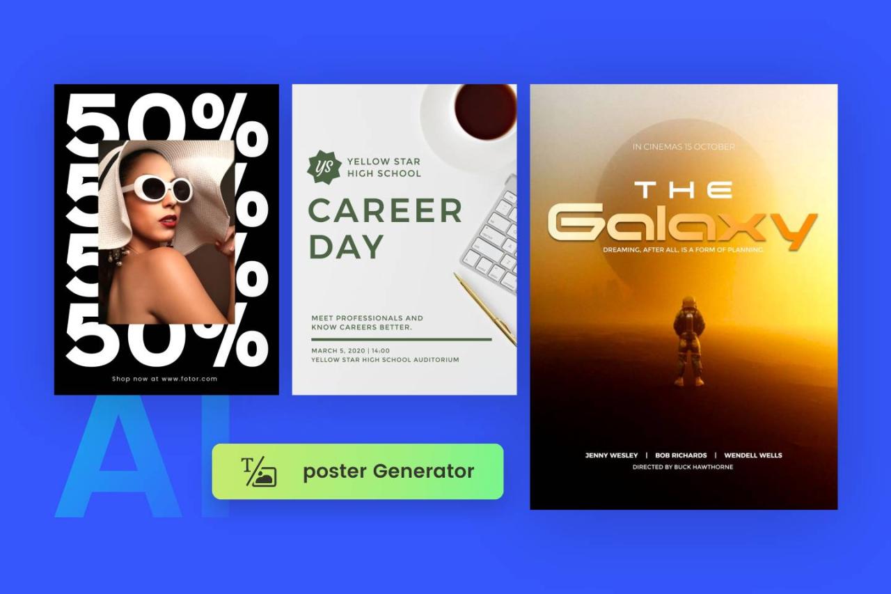
Discover the effective ways to generate eye-catching infographic posters using artificial intelligence. This guide offers a comprehensive overview of AI-powered tools and techniques that streamline the design process, making it accessible for users seeking professional-quality visuals with ease and efficiency.
By leveraging advanced AI platforms, you can seamlessly plan, design, and customize infographic content, from creating visual elements to finalizing polished posters suitable for sharing or printing. This approach not only saves time but also enhances creativity and consistency in your visual communications.
Overview of AI tools for infographic poster creation
Artificial Intelligence (AI) has revolutionized the way visual content is designed and produced, offering innovative tools that streamline the creation of engaging and visually appealing infographic posters. Leveraging AI in this domain not only accelerates the design process but also enhances creativity by providing intelligent suggestions and automating complex tasks. These tools are transforming traditional graphic design workflows, making high-quality infographic creation accessible to a broader range of users, regardless of their technical expertise.
Modern AI platforms incorporate advanced algorithms, machine learning, and neural networks to understand visual aesthetics, color schemes, and layout optimization. They are capable of generating layouts, selecting harmonious color palettes, and even suggesting relevant icons and images based on the content provided. This integration of AI into design processes enables the fast production of professional-grade posters suited for marketing, education, and data presentation.
Popular AI platforms and software used for generating posters
The landscape of AI-powered infographic creation tools includes several renowned platforms that cater to diverse needs, from simple template-based designs to highly customizable outputs. These platforms harness AI capabilities to assist users at every step, from initial concept to final delivery.
| Platform | Key Features | Use Cases |
|---|---|---|
| Canva with AI integrations | AI-driven design suggestions, automatic layout adjustments, intelligent image cropping | Marketing posters, educational infographics, social media content |
| Piktochart | Template-based design with AI-enhanced customization, data visualization tools | Business reports, data-driven infographics, corporate presentations |
| Visme | AI-powered design assistance, interactive elements, rich multimedia options | Interactive infographics, training materials, marketing campaigns |
| Designs.ai | Automated logo, video, and poster creation, AI-based color palette and font suggestions | Branding materials, quick poster generation for campaigns |
| Crello (now VistaCreate) | Smart design tools with AI-powered background remover, layout recommendations | Event posters, social media infographics, promotional materials |
Benefits of using AI for infographic design over traditional methods
Integrating AI into infographic poster creation offers numerous advantages that enhance efficiency, quality, and accessibility. These benefits address common challenges faced in traditional design workflows, providing compelling reasons for adopting AI-driven tools.
“AI reduces the time required to produce high-quality visual content by automating routine tasks and offering intelligent suggestions, thereby enabling designers to focus on the creative aspects.”
- Speed and Efficiency: AI tools can generate layouts, suggest color schemes, and automate image selection, significantly reducing design time.
- Consistency and Quality: AI algorithms maintain consistency in style and alignment, ensuring professional and cohesive visual outputs.
- Accessibility: AI-powered platforms often feature user-friendly interfaces that lower the barrier to entry for non-designers, empowering smaller businesses and individuals to create impactful infographics.
- Cost-Effectiveness: Automation reduces the need for extensive manual work and expensive design services, making professional-quality posters affordable for a broader audience.
- Enhanced Creativity: AI tools provide innovative suggestions and alternative designs that might not be immediately apparent to human designers, fostering more creative exploration.
Planning and Conceptualizing Infographic Content with AI
Effective planning and conceptualization are vital stages in creating engaging and informative infographic posters. Leveraging AI tools during this phase can streamline the process, ensuring that the content is data-driven, well-structured, and visually compelling. By systematically gathering relevant data and defining clear core messages, creators can develop infographics that resonate with their audience and communicate complex information succinctly.
This section explores how to utilize AI for organizing data, identifying key messages, and establishing visual hierarchy, thereby laying a solid foundation for impactful infographic design.
Gathering Data and Identifying Key Messages for the Poster
At the outset, the primary task involves collecting accurate and relevant data that will underpin the infographic’s content. AI-powered data scraping and analysis tools can aid in sourcing information from credible databases, research papers, industry reports, and news outlets. These tools can also analyze large datasets to extract trends, patterns, and significant insights that are vital for the narrative.
Once data is gathered, the next step is to identify the core messages that the infographic must convey. AI algorithms, such as natural language processing (NLP), can analyze textual data to highlight the most frequent themes, s, and sentiment. This helps in pinpointing the main takeaways that should be emphasized to the audience.
“Prioritizing key messages ensures the infographic remains focused and impactful.”
Organizing Information into Logical Sections Using HTML Table Layout
Structuring content logically enhances readability and guides the viewer’s understanding seamlessly. AI tools can assist in creating an organized layout by analyzing the content and suggesting optimal section divisions. Using HTML tables, content creators can define clear categories, such as introduction, data points, comparisons, and conclusions, each occupying distinct table cells for clarity.
When designing the poster, consider grouping related data together within table rows or columns, which allows for consistent visual separation. For example, a table may have headers like “Year,” “Sales,” and “Growth Rate,” with corresponding data neatly aligned, making complex data easier to interpret at a glance.
Proper organization facilitates thematic flow, making complex data easily digestible for viewers.
Demonstrating Visual Hierarchy to Emphasize Main Points
Establishing a clear visual hierarchy directs the viewer’s attention to the most critical information first. AI design tools can analyze the content’s importance levels and suggest visual cues such as font sizes, colors, and placement. Main points should be prominently displayed using larger fonts, contrasting colors, or bold styles, while supporting details are presented more subtly.
Implementing visual hierarchy involves strategic use of spacing, color contrast, and typographic emphasis to differentiate primary messages from secondary details. For instance, a headline summarizing key findings might be positioned at the top center with a larger font size and a bold color, whereas supplementary data can be placed in smaller sections below or beside it.
Effective visual hierarchy enhances comprehension by guiding the viewer’s eye through the infographic in a logical and impactful manner.
Designing Infographic Posters Using AI-Powered Tools

Creating visually compelling infographic posters with AI-powered tools streamlines the design process, enabling users to produce professional-quality visuals efficiently. These tools utilize advanced algorithms to assist in layout creation, color harmony, and font selection, making them ideal for both beginners and experienced designers aiming to expedite their workflow while maintaining high standards of aesthetics and branding consistency.
Designing an infographic poster with AI software involves a systematic process of inputting relevant data, choosing appropriate templates, and customizing visual elements. This process ensures that the final product aligns with your message, branding guidelines, and target audience expectations. Understanding each step enables users to leverage AI capabilities effectively, resulting in visually appealing, informative, and cohesive posters.
Inputting Data and Selecting Design Templates
Effective infographic design begins with inputting accurate and organized data into the AI tool. Users typically upload datasets, enter textual information, or integrate data from external sources such as spreadsheets or databases. The AI software then analyzes this data to suggest suitable design formats. Selecting a template is a critical step, as the AI provides a range of professionally designed options tailored to different themes, industries, or presentation styles.
Many AI platforms offer templates optimized for clarity and visual impact, allowing users to filter options based on purpose, such as marketing, education, or data analysis. The choice of template influences the overall structure, layout, and visual hierarchy of the poster, helping to ensure that the content is both engaging and easily digestible.
Customizing Layouts, Color Schemes, and Fonts for Branding Consistency
Customization enhances the uniqueness of each infographic, aligning it with specific branding or stylistic preferences. AI tools typically include features that allow users to modify layouts, color schemes, and fonts to reflect brand identity or personal style. These adjustments are crucial for maintaining consistency across multiple visual communications, reinforcing brand recognition.
For layout customization, users can rearrange content blocks, adjust spacing, and select grid structures to optimize information flow. Color schemes can be fine-tuned using AI suggestions based on color theory principles, ensuring visual harmony and accessibility. Fonts can be selected from extensive libraries, with options to set font sizes, styles, and weights to emphasize key data points or headings. Some AI tools also offer the ability to save custom style presets, facilitating uniformity across various posters.
| Component | Description | Customization Options | Design Impact |
|---|---|---|---|
| Data Input | Uploading datasets or manually entering textual information that forms the core content of the infographic. | File uploads (CSV, Excel), manual entry, data integration from APIs. | Ensures accuracy and relevance of visualized data. |
| Template Selection | Choosing from pre-designed layout templates suited to the infographic’s purpose. | Filtering by industry, style, or theme; previewing options before finalizing. | Sets the foundational structure and visual tone. |
| Layout Customization | Adjusting the arrangement of content blocks and visual elements. | Rearranging sections, resizing components, applying grid systems. | Improves readability and flow of information. |
| Color Schemes | Applying color palettes to enhance visual appeal and brand recognition. | Choosing from AI-suggested palettes, customizing hues, saving brand colors. | Creates visual harmony and emphasizes key data points. |
| Fonts | Selecting typography styles for headings, subheadings, and body text. | Accessing extensive font libraries, adjusting sizes and weights. | Boosts readability and aligns with branding style. |
Generating Visual Elements with AI

Creating compelling visual components such as icons, charts, and illustrations is essential for crafting engaging and informative infographic posters. AI-powered tools have significantly streamlined this process, enabling designers and content creators to produce high-quality visuals efficiently. By leveraging AI, it is possible to generate diverse visual assets that are tailored to specific themes, data sets, and stylistic preferences, ultimately enhancing the clarity and appeal of the infographic.To effectively produce detailed and relevant visual assets using AI, it is important to provide clear, descriptive prompts that specify the desired style, content, and context.
AI image generation models interpret these instructions to create visuals that align closely with the intended message. Ensuring that prompts include information about color schemes, iconography, and the level of detail helps achieve more accurate results. Additionally, iterative refinement—where initial outputs are reviewed and adjusted—can lead to optimized visuals that meet professional standards and project requirements.
Creating Icons, Charts, and Illustrations with AI Image Generation
AI image generation techniques facilitate the creation of a wide range of visual elements crucial for infographic posters. For icons, concise prompts describing the object and its style—minimalist, flat, or detailed—guide the AI to produce icons that are visually consistent and contextually relevant. For instance, requesting a “simple flat icon of a smartphone with a blue background” yields a clean, modern icon suitable for technology-related infographics.
Generating charts and illustrations involves providing AI with data-driven or thematic descriptions. For example, describing a “bar chart illustrating quarterly sales growth with vibrant colors” prompts the AI to create a visual that accurately represents the data while maintaining aesthetic appeal. Detailed prompts enhance the relevance of the generated visuals, especially when including specifications such as color preferences, style (e.g., infographic style, hand-drawn), and complexity level.
“Clear and detailed prompts are key to generating high-quality visual assets with AI. They serve as precise instructions that help AI understand the context, style, and specifics of the desired image, ensuring the output aligns with the overall design goals.”
Organizing Visual Components for Clarity
Arranging visual elements systematically enhances the readability and professional appearance of the infographic poster. Utilizing HTML table cells or blockquote sections can effectively organize icons, charts, and illustrations, ensuring each component is distinctly presented and easy to interpret. For example, a table layout can align related icons and data visualizations side by side, creating a cohesive narrative that guides viewers naturally through the information.
When integrating generated visuals into the poster, consider grouping similar assets within a

